
Album Art: The Good, The Bad and The Ugly
- Matt Austin
- Nov 7, 2022
- 5 min read

With the recent release of the Beatles re-mastered Revolver, the 1966 album has been seen almost everywhere in fab four circles for the last few weeks. Revolver is, without doubt, an exceptional album. It demonstrates the evolution of The Beatles as musicians, as well as an overall shift in style within popular music. But what is most remarkable about Revolver is its cover.
Revolver is one of the first albums to feature what we now would consider to be ‘artwork.’ Prior to its release, the majority of album covers were dull, boring, and practical at best. Usually depicted was an image of the artist with the title of the album. What else was needed? People in record shops weren’t there to visit an art gallery. They weren’t paying any attention to the sleeve, because they cared about what was on the disk inside.
This pattern started to change however during the 1960s as artists looked to find new ways to express themselves through their album covers, and who else to push boundaries but The Beatles. Their 1964 album A Hard Days Night departed from showing a simple image of the band, instead playing up the release of the film by the same name, showing a photo-booth style grid of various pictures of music’s newest stars.

Whilst this may have been a small diversion from the norm, Revolver was to be entirely different. Manager Brian Epstein felt the new album needed a cover to match the experimentalism of the music. He enlisted German artist and old friend of the band, Klaus Voorman, to design the album and reportedly wept with joy when he saw the finished product. With slightly hallucinatory drawings of the four Beatles chaotically surrounded by a collage of random photographs, Voorman had met the brief: it was experimental in every sense of the word.
The cover of Revolver has subsequently been heralded as one of the greatest album covers and could be considered the most iconic in history, if not for the subsequent release of 1967’s Sgt Pepper’s Lonely Hearts Club Band: A fine example of The Beatles upping themselves as they so often did, even in the art department. In addition, Revolver's impact was not simply confined to the music, as album artwork exploded in popularity after its release, which got me thinking more about the importance of the cover. I have taken a look into three albums’ cover art to explore what makes it great, or not so great, and how it shapes our view of the music, even before hearing a single note. As with all art, this is of course entirely subjective, and I am no art critic. This is, in my humble opinion, the Good, the Bad, and the Ugly of album cover art.
The Good: Okie, J.J. Cale, 1974

Okie is the third studio album from guitarist and pioneer of the Tulsa Sound, JJ Cale. Cale, who inspired countless musicians, most notably Eric Clapton, tended to avoid the limelight, and despite his widespread influence, remained relatively obscure outside the Tulsa music scene.
This album cover is simplicity at its best. Although released in the mid 1970s, the theme harks back to the Blues era of the Great Depression: Hopping trains cross-country, with the imposing wheels of the machine in the foreground and the vast rolling hills in the background, a travelling songster on a seemingly endless journey. This cover is the true mark of a troubadour. All we see aboard the train is a guitar and a man’s shoes, the most important things to an itinerant musician. Cale's face is not depicted, a common theme on his album covers, which seems to almost sum up his career as one out of the spotlight. Cale is one of the most covered musicians of the 20th Century, who never considered his personal image to be of great importance, rather what mattered were the sounds he produced. The simple nature of the artwork on Okie, whether by design or not, reflects this perfectly.
The Bad: Disraeli Gears, Cream, 1967

Another mention for Eric Clapton, however this time on a slightly less positive note. Cream’s second studio album, Disraeli Gears, was released in the immediate aftermath of the 1967 Summer of Love. This was the year of psychedelia, as the world was no longer in black and white and music had ditched its drab formal look, in favour of colour and vibrancy.
The artwork on Disraeli Gears however is nothing more than a poor example of an album cover hopping aboard upon the hippie bandwagon. Cream were not the only artist to do this, but it is clear that their second album cover was merely a late attempt to cash in on the Summer of Love. It shows a departure from the band’s first album cover, which features a photograph of the group in mock RAF gear. The artwork on Disraeli Gears still features an image of the three band members, but squished among a disorganised collage of nondescript psychedelic doodles. The cover’s artist, Martin Sharp, was, as he described, going for a ‘warm fluorescent sound.’ However what he produced is an unfortunately overcrowded, over-sensory mess, which reeks of falsity. Colours and vibrancy may have been all the rage in 1967, but the cover of Cream’s Disraeli Gears is a glaring example of how it is possible to try just a little too hard.
The Ugly: Sticky Fingers, The Rolling Stones, 1971
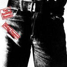
Sticky Fingers is the The Rolling Stones' first album of the 1970s, a decade which would see them release some of their most critically acclaimed music. With a few changes in personnel, they pushed on from their incredible success of the late 1960s to ascend to become the ‘greatest rock band in the world.’
The cover of Sticky Fingers is one of the most iconic of all time. The vulgar image of a male crotch with a visible outline of a penis is as suggestive as an innuendo can get. This album art is highly representative of the band’s development. Upon the dawn of the 1970s, the band started to move away from politics and gravitated towards other subjects, most notably sex, which is clearly reflected on this cover. Mick Jagger, one of the most sexualised stars of the era, was originally alleged to be the model for the cover art. However, photographer Andy Warhol denied that the famous crotch belonged to the Stones frontman, when in fact, the jean clad model has never been identified, which only adds to the intrigue.
When commissioning the cover of Sticky Fingers, The Rolling Stones were not satisfied with just a photograph. The original release of the LP included a working zipper on the jeans, which opened to reveal a sub-cover image of white briefs. Although pushing boundaries as one of the first examples of interactive cover art, the zipper was actually at fault for causing severe damage to the vinyl, from stacked shipments of the record. A fun idea in theory, but not in practice. The album also featured an inside sleeve depicting the first use of the tongue and lips image, now a staple of the Rolling Stones brand. Despite its various misgivings, the artwork on the cover of Stick Fingers is an iconic symbol of rock and roll. A true product of its time, it depicts a sexy, yet vulgar and dirty and side to album art, themes which would become inseparable with rock music of the 1970s.
Album cover art, in theory, has no real purpose for the medium it is assigned to, rather it can be used by the artist as an additional means of expression, beyond the music. What I have shown are just three examples that demonstrate the diversity of album artwork, and as with any artform, to call these 'The Good, The Bad and The Ugly' is entirely subjective. What is true however, is that the cover of The Beatles Revolver created the idea that importance should be attributed to album artwork and paved the way for future releases. It also proved that the album cover has the power to become iconic, and sometimes, as in the case of Revolver, almost as iconic as the music itself.


Comments